angle-graphic

Using Technology to Standardize Your Cx Business Practice

The Business of Commissioning

Commissioning is a service industry, and like all service industries, one of the challenges is maintaining consistent quality across the board. I’ve experienced and seen many strategies to consistently deliver high quality results: selective hiring practices, professional development efforts, oversight by experienced managers, customer audits, and many other techniques.

Most of these approaches are people oriented, which is a good thing in a service business. But once those good people are brought into the firm, they may not always be given the tools and resources necessary to succeed. It’s important to also consider how one can standardize on the basic building blocks of the commissioning job, such as checklists, functional tests, status flows, and the look and feel of deliverables.

First, Centralize

A great place to start standardizing is by centralizing project data. Just by virtue of being a centralized, accessible store for your project data, cloud-based software such as CxAlloy TQ rids you of file version confusion, eliminates uncertainty about whether you are seeing the most up-to-date information, and gives insight into the status of all your projects. But these benefits, while valuable, are provided by almost any internet-based tracking tool. What more can be done specific to commissioning?

Build On Past Success

With commissioning, the question becomes the ability to repeatably apply hard-won, high-quality processes. CxAlloy TQ can help any commissioning firm standardize the fundamental elements of their Cx process so that every project starts on a firm footing with the experience of the entire firm easily accessible through standardized templates and settings.

For example, CxAlloy TQ makes it possible to build a company-wide library of checklist and test templates. These templates are automatically available to every project. The creation and editing of this company library of templates is access-controlled, so it can be carefully managed and curated by the company’s most senior and experienced commissioning authorities. The wisdom of those experienced employees, expressed through what’s included (and not included) in the templates, is then available to every project. With a company template library even the fresh-faced Cx authority just entering the industry will have a strong foundation to start from.

If you’re concerned about being hamstrung by overly rigid templates, don’t worry: CxAlloy TQ makes it possible to copy a company template into a project and make project-specific modifications. This approach gives you the best of both worlds: start from a solid, vetted template, then make project-specific changes as needed.

Implement Repeatable Processes

Another problem that arises in commissioning firms is ensuring that the same process is employed across all your projects for resolving issues, verifying checklist completion, or performing functional tests. CxAlloy TQ enables you to establish a process, defined as access-controlled statuses, that can ensure each issue, checklist, or test passes through specific stakeholders or stages before being closed or completed.

For example, you could require that all issues be reviewed by a senior commissioning authority before being closed, or that all checklists be reviewed by someone at the firm before being accepted. Because of the flexibility of the system in CxAlloy TQ, almost any process is possible. Route issues, checklists, and tests through a single individual, multiple individuals, any member of a company, or anyone occupying a specific role (such as Cx Authority or Project Manager). Whatever you choose, once you establish the process you can standardize it across all your projects.

Present a Consistent Look and Quality

Standardizing internal practices is only half the battle. You’ll also want to present a consistent, professional face to those outside the organization. This can be surprisingly challenging as consistency oftentimes relies on an employee’s ability to wrangle Word and Excel. And even if a project manager creates consistent reports with her projects, are they consistent with those created by other project managers? And what happens when a new PM has to be brought in?

I’ve found the key to getting consistency in reporting is to make it nearly impossible to not be consistent. Reporting in CxAlloy TQ is so easy that PM’s naturally migrate to it. And it’s always consistent, clear, and attractive. Oh, and the reports are branded with your logo, not ours.

Put It Together

The benefits of centralized project data, the power of reusable templates and processes, and the professionalism of consistent, clear reports together enable a higher level of commissioning quality. That’s what we promise with CxAlloy TQ. Visit http://blog.cxalloy.com/tq to learn more.
Making Lemonade out of Lemons – A Great New Update to CxAlloy TQ Mobile

The newest version of Apple’s mobile operating system, iOS 7, is a great update in a lot of ways. In at least one area, however, it’s not so great. In fact you might even call it a lemon. I’m talking about the built-in browser, Safari. Although some nice user-facing changes were made, from the developer perspective the new Safari came with significant bugs and was far more crash-prone. As one noted web expert put it, “I can say without fear of mistake that this is the buggiest Safari version since 1.0”. (http://www.mobilexweb.com/blog/safari-ios7-html5-problems-apis-review)

Some of you may have experienced that the stability and functionality of the mobile version of CxAlloy TQ was degraded under iOS 7. We worked quickly to address the major functionality issues and put out an update shortly after the release of iOS 7. However, as we researched the stability issues we discovered they were more deeply rooted. So we rolled up our sleeves and undertook some more significant changes to the mobile app. Luckily, we think the end result is something that’s better than what we had before under iOS 6.

First, we have added paging when viewing checklist and test lines. We’ll now show you 50 lines at a time. Page navigation can be found both above and below the lines so you don’t need to scroll back to the top to go to the next page. And don’t forget that you can tap the “Page X of Y” button to quickly jump to any page! This change alone has eliminated nearly all the crashes we were seeing under iOS 7 and even some crashes we would see under iOS 6.

image

Next, we have standardized on an approach to loading the lines of both checklists and tests. Now both areas will refrain from loading any lines until you explicitly request it. This makes the software much faster than before when jumping from checklist to checklist.

These changes required us to rethink how we do line reordering inside a checklist or test. We have come up with a new approach that we think will work well for quick in-the-field modifications. To move a line, tap the line, then tap “Move”. A simple form will appear for moving the line anywhere above or below any other line in the checklist or test.

image

Finally, we have implemented a great improvement suggested by one of our users – when filling out the note for a checklist or test line, the form will now include the text of the line so you know what you are answering! As someone that can forget what I’m doing even while I’m doing it I can appreciate this addition.

We think we’ve made some sweet lemonade out of some iOS 7 lemons. We hope you benefit from these features. As always, drop us a line at support@cxalloy.com with any problems or suggestions you might have. We are always listening.

CxAlloy TQ Update – Custom Branding and More

CxAlloy TQ just got a big update over the Labor Day holiday. This update includes some highly requested features, like custom branding, plus a few surprises that we think you’ll like.

Dashboard

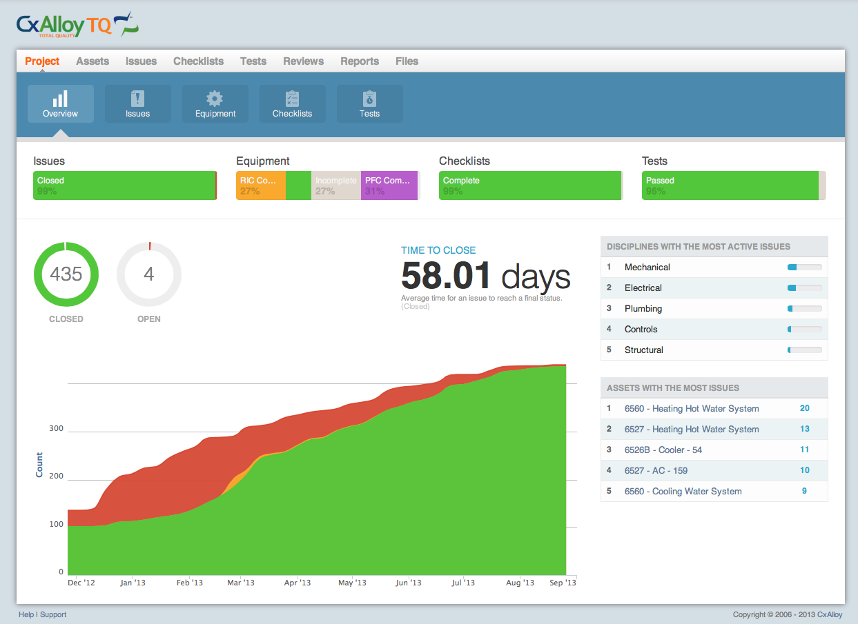
The first thing you’ll notice is the updated project dashboard. This new dashboard does a much better job of giving you a true overview of your project’s status. At the top you’ll find status breakdowns for issues, equipment, checklists and tests. Below that you’ll find detailed information about your project’s issues, including the average time to close issues and a graph of issue statuses over time (if you aren’t seeing any historical issue data, don’t worry, we’ll be backfilling this information in the coming weeks). Finally, we’ve included some metrics to identify pain points: a list of the disciplines (such as mechanical, electrical, etc.) with the most issues, and a list of the assets with the most issues. Over time we hope to expand out these metrics, so if there is something you’d like to see, please let us know!

Custom Attributes

The next feature is one we have been piloting for a while behind the scenes: custom attributes. Attributes are named properties of assets, such as model number, voltage, air flow, and so forth. You can now add your own custom attributes to your project. We still provide our global list of common attributes, but if you’ve got something unique you’d like to track as an attribute, no problem! Just go to the “Attributes” section in your project settings and add it. Custom attributes work just like any other attribute, so you can link your checklist and test lines to them in addition to adding them directly to an asset. And for account administrators, custom attributes can be added at the account level. Those attributes are then accessible to all projects within your account.

Finally, we’ve delivered white labeling for our premium customers. White labeling allows account administrators to replace the CxAlloy logo with a logo of their choosing. This logo will be used on the site itself and in all PDFs. White labeling fits in perfectly with our philosophy: we want to help you build your brand, not have you help us build our brand. When you are successful, we are successful. We consider all of our customers partners and we hope white labeling will strengthen that partnership.

Of course, as always, there are a number of smaller changes and fixes to make the software work better for you. To learn more you can read our release notes.

We’re quite proud of these new features and we certainly hope you like them too. If you have any questions or suggestions, please get in touch. We are listening.

Jacob Terry

Director of Product Development

Locations in CxAlloy TQ

When we were building CxAlloy TQ we knew we wanted a flexible, powerful system for locations. We didn’t want to just have a list of rooms and a “Location” field on an issue. We wanted to be able to express the relationships between locations and to deeply integrate them with equipment, issues, checklists, and tests. This desire grew out of specific uses that we wanted make possible, including:

  • Getting a list of all issues on a floor, including issues associated with equipment on that floor.
  • Getting a list of all equipment in a building on a multi-building project.
  • Making it natural to create locations like “Roof” and “Garden” that didn’t fit well into the Room Name/Room Number model.
  • Creating checklists based on a location instead of equipment for room walkthroughs or similar applications.
  • Allowing the creation of relationships between locations, but not require those relationships.
  • Seeing easily the related room, floor, and building for equipment or items associated with that equipment.

In coming up with solutions that addressed these needs we were greatly aided by the work done for the COBie standard (you can read more about our integration with COBie here). In particular their concept of “spaces”, a broader concept than “rooms”, was a great insight.

Besides calling rooms “spaces”, the basics of locations work as you’d expect – buildings contain floors, which in turn contain spaces. Importantly, you don’t need a building or a floor to add spaces. By allowing you to add spaces first and then connect them to floors later (or not at all), we make the software faster and more flexible. When you are adding equipment and realize you need to add a new space, it’s much nicer to be able to add the space right then without having to worry about what floor and building it’s in, especially since you may not have created the building or floor in CxAlloy TQ yet.

Equipment Add Space

Earlier incarnations of CxAlloy TQ had both an “Equipment” and “Location” field for issues. As we put together the current version we realized that having both fields is redundant. If the equipment has a location and the issue is connected to the equipment, shouldn’t we know the location?  CxAlloy TQ is much smarter now – for example, let’s say you create an issue for AHU-1 which is in Room 101. When you create an issue for AHU-1, you don’t need to add “Room 101” to the issue because it’s implied by the connection to AHU-1. And not only that, we know it’s on the first floor in the main building!

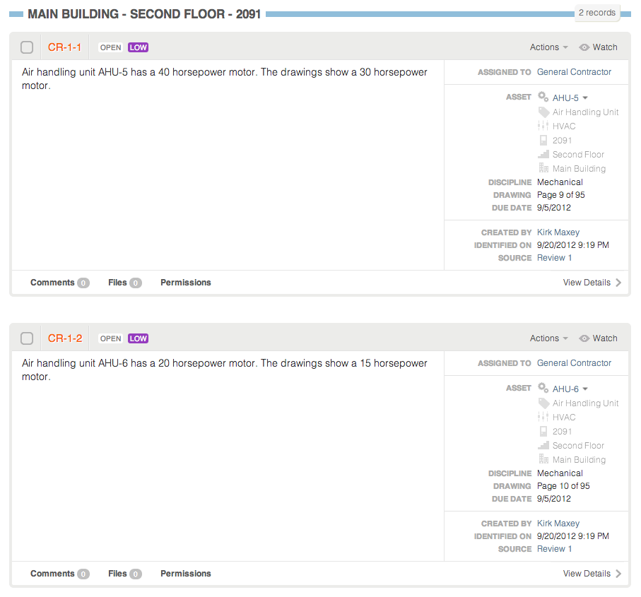
Of course, these connections aren’t that useful unless you can use them to organize your issues. We knew that and carried this concept into our filters and sorts. For example, if you filter your issue list to the first floor, you’ll see issues connected to equipment on the first floor right along with issues connected to spaces on the first floor and issues connected to the floor itself. You can sort by location as well. And, like with all of our filters and sorts, you can generate a professional PDF of the filtered and sorted set.

Issues Location Sort Expanded

Finally, you want to be able to see these relationships as you work with issues, equipment, and other items. We do this by having a list of related location information showing you that not only, for example, is an issue connected to AHU-1, but it is also in Room 101 on the first floor of the main building.

Asset Tree

I’ve been focusing primarily on issues and equipment, but CxAlloy TQ lets you take locations even farther by integrating with Checklists and Tests. All of the same functionality that I’ve outlined for issues is available for Checklists and Tests. This really opens up their potential uses.

The flexibility and power that locations in CxAlloy TQ affords – while still being easy to use – is really quite remarkable. I hope I’ve been able to show you a little of the benefits that CxAlloy TQ and its location model can bring to your projects.

Smoke, Mirrors, and 300 Milliseconds

Tablet devices, particularly the iPad, have been described as “terrible computers with pretty decent graphics processors”. The hardware capability of your iPad is far less than what you’d find on the computer on which you are likely reading this post. That created a challenge when it came time to design CxAlloy TQ for tablet devices. The iPad seems pretty quick – icons slide around the screen as smoothly as you can swipe them. Even using CxAlloy TQ from Safari on iPad seems to operate similarly to using it from a desktop browser. So, it may seem like designing a tablet-oriented interface for the software would just be a matter of creating bigger, touch-friendly buttons, right? Not exactly.

Offline Changes Everything

With the CxAlloy TQ mobile web app we wanted to do more than provide a touch-friendly interface for the software. After all, the desktop software is already fully functional on an iPad. The primary purpose of CxAlloy TQ would be to work offline. This one feature, offline access, completely changed how the mobile app would function compared with the desktop version. It would be a challenge, but we knew we could tackle it. And we knew we had to – the benefits of being able to work in the field without an internet connection were just too great to ignore.

One of the biggest challenges was performance. So-called “native” apps – those you’d download from the App Store or Google Play Store – interact more directly with the hardware[footnote 1], while the web technologies upon which CxAlloy TQ is built operate at a higher level. Using web technology gives us more flexibility to fix bugs quickly and roll out new features as soon as they’re ready, but require us to more carefully optimize our code to ensure the app is fast and responsive.

You may think it can’t be that difficult since you probably visit lots of regular web sites on your iPad and they don’t have any performance problems. Perhaps you’ve even used CxAlloy TQ – the desktop version –  from your iPad and found that it is pretty zippy. This is because of another advantage that traditional web apps have – servers. Most of the heavy lifting of searching through records and building pages is done by dedicated servers that were built to do just that. So, every time you visit a page in CxAlloy TQ, most of the work to create the interface in front of you was done by the servers and shipped down to your browser. But in order for the CxAlloy TQ web app to work offline, it can’t depend on the availability of the server to do the heavy lifting. It’s on its own to process data and build the interface. It has to do this with the iPad’s relatively meager resources.

Zombies, Workers, and Hardware Acceleration

So how do we manage to create a fast and responsive web app? Well, there are a few tips and tricks we can use to spread the work around and manage the device’s memory effectively.

For example, when the software syncs its data up to the server, it does it using a background process called a “web worker” which means that the main processor can spend its time making sure the interface is snappy while the background is busy chugging away sending records to and from the server.

Another trick is to utilize 3D technology to draw the interface in the mobile web app. This may seem odd seeing as how there aren’t any 3D graphics in the software, but by offloading certain interface elements to the tablet’s 3D hardware (which is surprisingly powerful), we can free up the main processor for data crunching while still keeping things sliding around smoothly on screen. Offloading something onto a dedicated piece of hardware is called “acceleration” and it’s a good name; graphics that are hardware accelerated are much, much faster than those controlled by the software itself.

Another challenge with offline web apps are zombies. Zombies are bits of code that seem to go away but actually hang around eating up memory (or “brains”, if you like) which slows things down.  They also sometimes will pop back up, causing errors when you least expect it. Like most zombies, they are difficult to track down and dispose of and will generally ruin your day. On desktop web apps, zombies are cleared out every time you navigate to a new page, but since the page never really refreshes in an offline app, we have to be vigilant in order to not cause zombies.

A Nip Here, A Tuck There

Hardware acceleration, background processing, and zombie-hunting coding practices are good overall habits for making sure things are running as smoothly as possible, but unfortunately, there is nothing we can do to speed up the iPad’s hardware. Some actions are just slower on an iPad. In those cases we can employ techniques to make the software feel faster.

Recently, we removed a 300ms delay on tapping elements such as buttons in the app. By default, an iPad will wait 300ms after you touch the screen before it counts it as “tapped”. It does this just to make sure you aren’t holding your finger down in order to “press” something. We don’t have anything in our interface that needs to be “pressed” so we included code that doesn’t wait for this 300ms before declaring something “tapped”. The result is an almost imperceptible change than makes everything “feel” much faster even if we only cut out 300ms from a tap.

Another recent change that helps to make the software feel faster is the addition of a loader on a record’s detail view. When you load up the checklist section, for example, it has to not only load up the list of checklists, but it has to load up the first checklist in the list (or the last one you viewed), as well as all of the checklist lines for that checklist, images that have been downloaded, and issues. It’s a lot for a humble iPad and it takes some time. By adding a large loading animation we communicate to the user that their request was received, providing a visual indicator for what is happening. We also added immediate color changes to list items when tapped to confirm to the user that the software has received the action and is working instead of the user waiting to see if the software really did register their tap. Uncertainty over what the software is doing leads to discomfort. And discomfort is a slow feeling. It may seem a little “smoke and mirrors”, but the end result is a mobile web app that feels responsive and quick even as it is processing large amounts of offline data.

— footnotes —

So-called “native” apps – those you’d download from the App Store or Google Play Store – are created using native technologies that are translated (or “compiled”) to the binary code that computers can understand before they are sent to users. Web technologies upon which CxAlloy TQ is built is “interpreted” code, which means that it is translated to machine-readable binary code every single time you use the app. Interpreted code is much more flexible than compiled code, allowing us to fix bugs and address problems more quickly and easily as well as give us the potential for a cross-platform app. But, since interpreted code is converted when it is run, it is slower than compiled code.

Introducing Progress Reports and Improved PDFs

I’m pleased to announce the launch of Progress Reports as part of the latest release of CxAlloy Total Quality (TQ). This release also features revamped PDFs and a number of other improvements. I’d like to give you a quick tour of these features and share with you some of our thinking behind them.

Progress Report
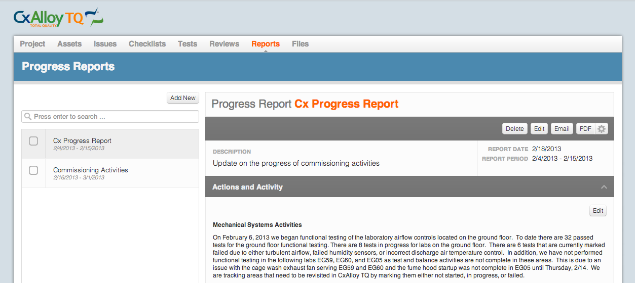
The new Progress Reports section.

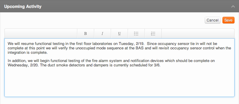
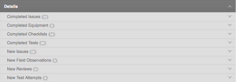
Progress Reports enable project managers to effectively communicate work done over a given time period. Project work happens in a lot of ways and in a lot of places – at planned site visits, in impromptu conference calls, at scheduled meetings, and via email, to name just a few. Some of this work is planned and structured, such as functional testing, while other work happens extemporaneously. Progress Reports allows for efficiently communicating both structured and unstructured work. For unstructured work, project managers can outline the work completed however they see fit as part of the “Actions and Activities” component of the report. CxAlloy TQ provides the common formatting tools necessary to write an effective summary of work, such as bold, italic, and underline text formatting and bulleted lists. Structured work over the selected time period (such as issues closed, checklists completed, and tests attempted) can be included automatically by simply selecting those options when printing the Progress Report PDF.

Progress Report Details
The Details section allows you to see what’s happened during the selected time period.

Progress Report Editing
Common formatting tools are available.

Progress Reports can be found under the “Reports” tab in your project. By default only account administrators have access to Progress Reports. Account administrators can grant access to other CxAlloy TQ users on the project by updating their permissions.

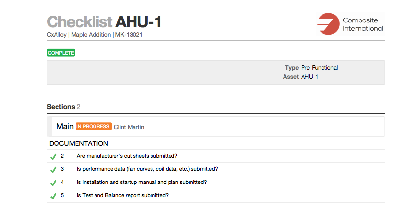
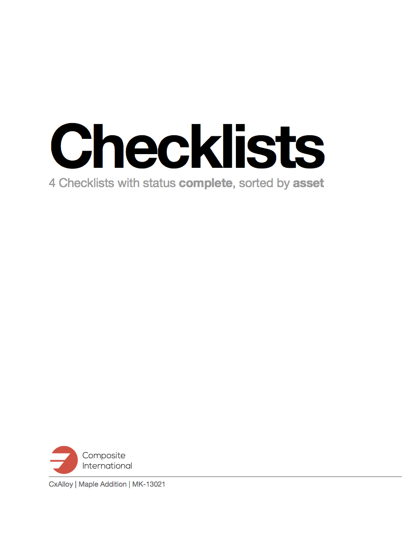
This update also features expanded and improved PDFs. We updated our PDFs to better accommodate the needs of project managers and in response to customer feedback. One thing we heard was that it wasn’t sufficient to include the project logo on only the first page of a given report. Now each printed item (such as a checklist or test) has a full header, including the project name, number, and logo. We also added full title pages to more clearly communicate the contents of a given report. Finally, we made the issues PDF more compact. Now this frequently printed document will require less paper and be easier to manage in the field.

The project name, number, and logo now repeats for each item.

PDFs now feature a bold, clear title page.

Not only did we improve the PDFs, but we added a lot of new ones! You can now print a PDF for any asset: spaces, zones, floors, buildings, equipment, equipment types, and systems.

As usual you can see the full list of updates in this release by checking the release notes.

I hope you’ll use and benefit from these new features. If you have any questions or comments, get in touch! We love to hear from our customers.

Jacob Terry

CxAlloy Director of Product Development

First COBie Compliant Commissioning Software

COBie

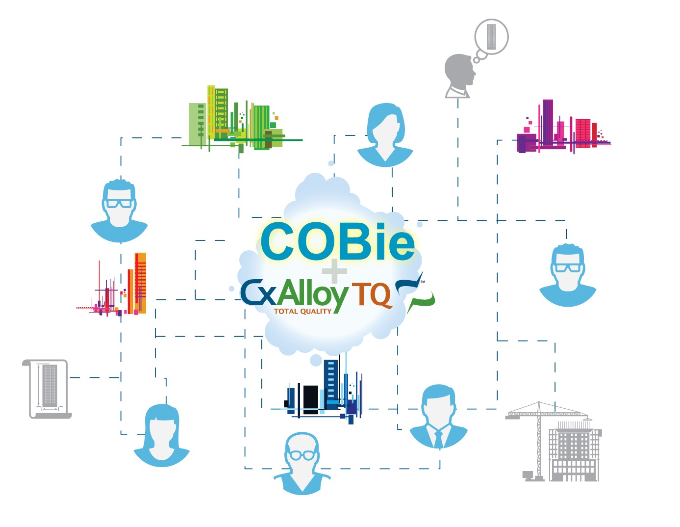
We are excited to share with you our latest news! CxAlloy Total Quality (TQ) has achieved COBie compliance as a result of our participation in the National Institute of Building Sciences’ COBie Challenge. CxAlloy TQ is the first and only software to include commissioning issues as part of full COBie compliance, and we are proud to share this accomplishment with you!

By achieving COBie compliance, CxAlloy TQ is even more useful for everyone involved in the design, construction, commissioning and operations of a building. CxAlloy TQ now allows for easy import of other COBie compliant data and quick export in the same format. By integrating with COBie, we have removed the barriers to communication and data sharing from design to construction to operations.

This latest free upgrade provides for an easier, more intuitive, and more productive user experience.  Our goal is to continuously improve our software to ensure that we are the best in the field.

For more information about COBie please see our website here or read the full press release here.

Thanks,
Kirk Maxey, CCP, QCP
Director of CxAlloy
Direct: +1 504-864-3504
Office: +1 678-324-3874

CxAlloy TQ Version 4

It’s finally here. Version 4 of CxAlloy TQ is now live!

We’ve been working diligently on the latest version of our CxAlloy Total Quality software and have now released it publicly. This is an exciting day for us at CxAlloy! This new version combines all the great features and benefits of version 3 with a whole lot of new features. New technologies have allowed us to again raise the bar on what quality management is all about.

What’s the same? We’ve kept the transparency and simplicity. Those things will never change. But we’ve updated a lot of the features you’ve come to enjoy, based on your feedback. Here’s a taste of what’s changed:

Notifications. Some folks like to get notified of every single change in their project. Some don’t want any emails at all. We’ve listened and devised a strategy to accommodate all preferences. Now each account user has a personal profile section that allows customized notification options. These options include immediate email notifications about all changes in a project or summarized daily emails of activity. You can change the frequency, the project, and even specific items of interest.

Offline Compatibility. Our software works well on a tablet, but there are times when you don’t have good Internet connections. To mitigate this we developed a mobile application that enables you to continue working in the database when Internet is not available. Just download your project to your mobile device while you are connected to the Internet. The ability to continue entering and accessing data is seamless whether connected or not. And the best part is the synchronization happens automatically the next time you are connected to the Internet. No interruptions, it just happens.

Customizations. When we first began developing CxAlloy TQ we met with industry professionals and made some big decisions about data organization. We then incorporated those decisions into CxAlloy TQ. Some of those organizational elements included issue statuses, report names, and permission levels. Over the past year, we revisited these options and decided to allow organizations to customize CxAlloy TQ more to fit their own needs. We believe this will allow even more groups to start enjoying the benefits of our quality management platform. We still believe in providing this structure, which we call, “sensible defaults.” However, account holders now have the option to customize CxAlloy TQ to best fit their internal quality process.

Top 3 Reasons to Upgrade to Cloud-based Design and Construction Software

Real-time data increases efficiency and quality. There’s no time like the present, especially when it comes to information. Desktop applications just can’t keep up when your team is spread out in the field, in the office, and everywhere in between. That’s why you need to have constant access to your data. Without it, you can’t make the most informed decisions, and that affects quality. If you have to wait until you can gather all the facts, then that affects your efficiency. Keeping all your data with you while providing a secured, access-controlled interface to update it allows you to stay ahead.

Spreadsheets can reduce your productivity. Time is one of the most significant first costs you will have. However, we must look past that initial investment on a given project and see what tools and processes maximize our return in the long run. Yes opening a spreadsheet and typing data is initially quicker than using other software, at least a little. However, updating it isn’t. Distributing it isn’t. Trending data certainly isn’t. Data entry speed is important, but it doesn’t capture the full lifecycle of an issue. For a slight tradeoff in initial time, a few seconds per issue on average, you can keep your information organized and provide a mechanism for collaborating effectively with your team. Then, when the project is finished, you can trend all that data and use for further analysis.

Portability is key.  How often do you have the luxury of waiting until you get back to the office to check for project updates? Those days are gone, and in order to keep up with the fast pace of squeezed project schedules, you must have the most up-to-date information at your disposal. With cloud-based software, you can take and update information wherever you go. There’s no need to invest in expensive enterprise equipment. As long as you have an Internet connection, you can collaborate with teams all over the world. And with newer technologies and multiple levels of networked devices, you can actually increase the reliability of data and minimize the risk of losing your information.

Being Future Friendly

Over the past year, we have been attempting to design and redesign our applications to meet the needs of all our clients. This has been an enormous challenge since our users come from varied backgrounds with some having little to no computer experience while others are pros. We also see a range of devices that are being used. New technologies are coming out at an increasing speed, and everyone wants their device to work instantly. With all these rapid changes, we’ve been consistently meeting to come up with ways to address these challenges.

I found an article recently that articulates the problem. Brad Frost points out in his article, we must work towards a web that is truly “Future-Friendly.” This means that we can’t get boxed in to a particular format and either ignore or react to whatever comes next. We need to prepare now for what’s coming next. This verbalizes exactly what we’ve been trying to do, but have lacked the words to describe it. We must get rid of the clutter, get rid of the distractions that people are now being bombarded with on a daily basis. When people visit our sites, they need to be presented with only the tools and features that they need, not some cute or fancy interface that puffs up the experience.

We also need to cater to our client’s devices. This doesn’t mean everything works in all places the same way. Instead we must evaluate the needs of the user in each situation and address those core challenges. Some of the other ideas out there include responsive web design, mobile first design, and getting away from viewing web pages as, well, pages. We’ll be discussing those later. Check back with us often, we look forward to hearing from you.